

Company
ImmoScout24

ImmoKlub
40% more conversions with a landingpage redesign
ImmoKlub bundles five very different benefits into one membership, and the old page struggled to explain them. The goal was a clearer message for the product, tested in our new look and feel.
Year
2025
UI/UX
Webdesign
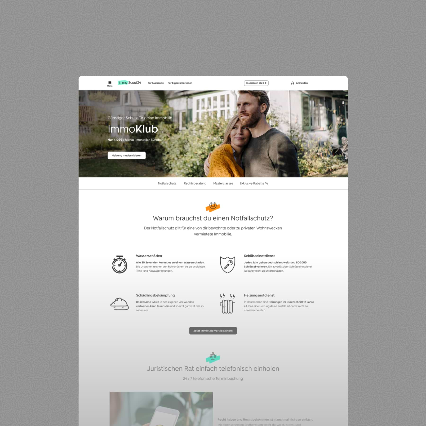
Old page = cluttered message
The old page opened with emergency protection, so visitors had to scroll through every section to see what the membership includes. Inconsistent layouts, an easy-to-miss price and few trust signals made the decision harder.
Idea
My idea was to show the whole offer at a glance, with key elements and trust signals above the fold. Bolder imagery of relaxed customers would add the emotional side the old page was missing.
New Look & Feel
In late 2024, I developed a new vision for ImmoScout24’s general look and feel: larger typography, calmer layouts, warmer photography and a modular set of components. The ImmoKlub redesign was one of the first places we tested this style on a live product page, and a chance to see whether it could support conversion, not just look good.
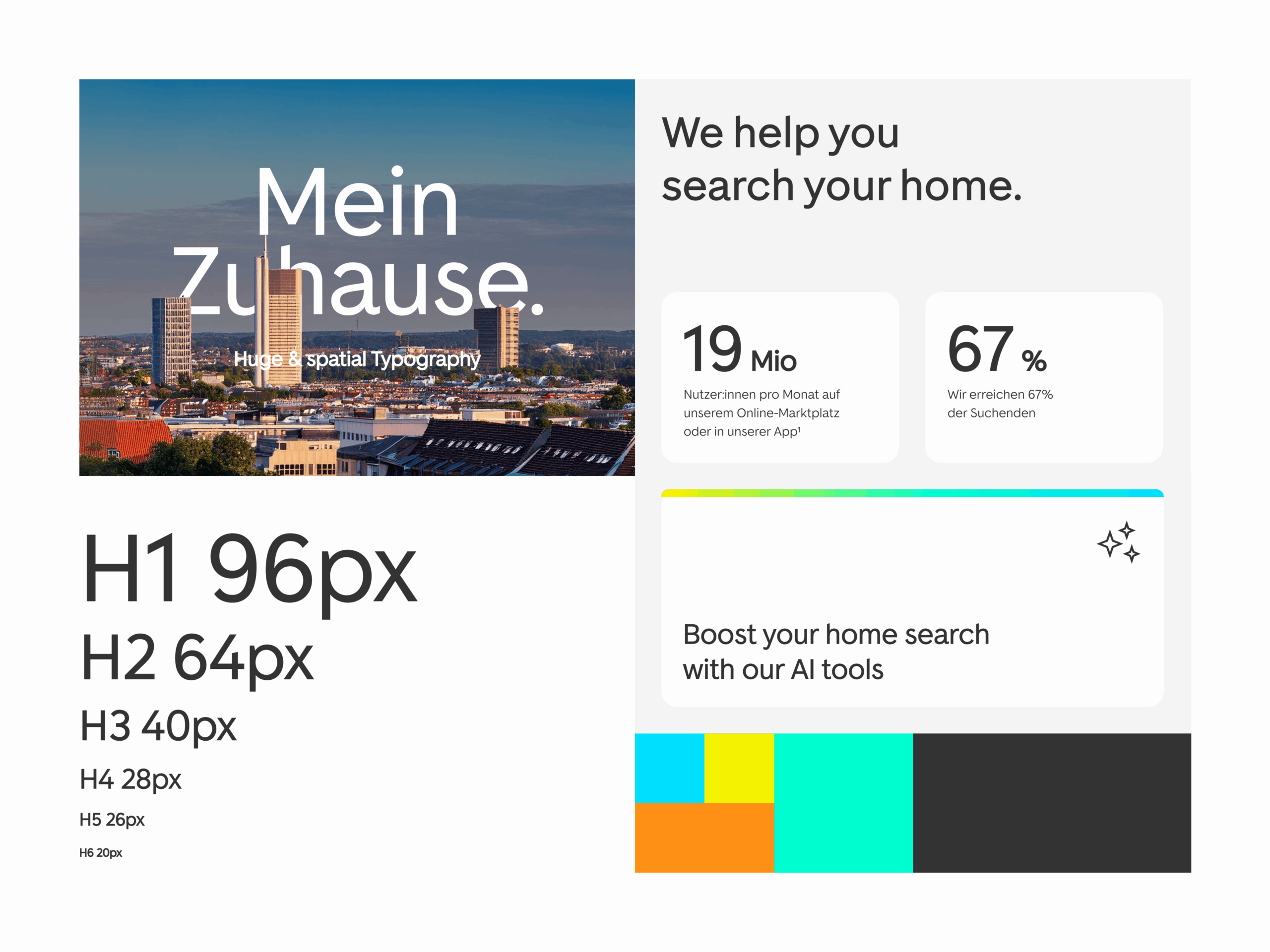
New Website Design
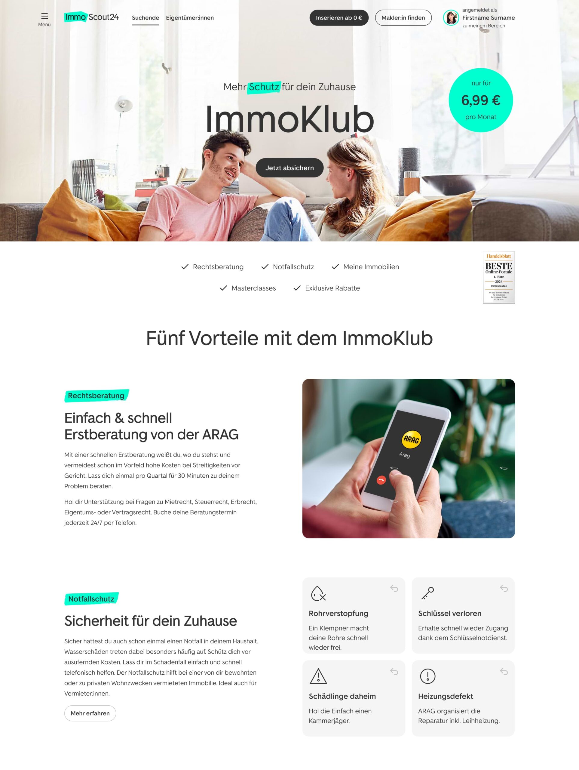
Big type and emotional visual
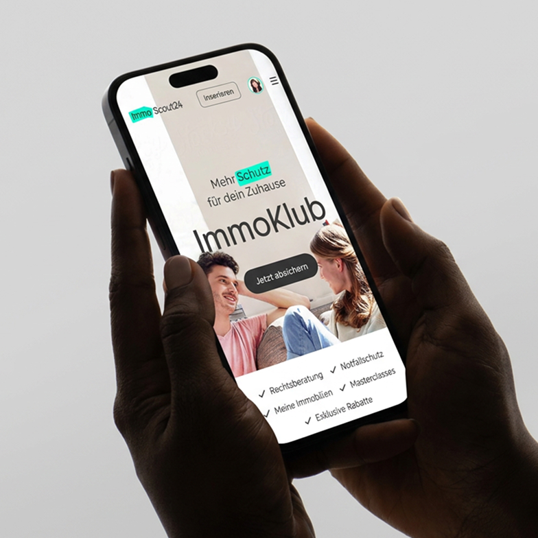
All benefits above the fold
Separate section for each benefit
Price visible at first glance
Results
40% uplift.
Two months.
In roughly two months, the redesigned page lifted conversions by 40%. It proved that a cleaner design, a clearer message and a compact layout make the decision easier.