Company
ImmoScout24
HeyImmo
AI Assistant
As the leading real estate portal in Germany, we recognize the growing trend of AI use by our users. With our own AI assistant we wanted to give better access to the real estate listings, our products and a huge amount of data.
Year
2025
Branding
Product design
Webdesign
Design Research
The AI Landscape
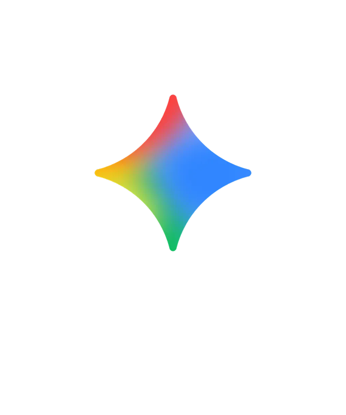
As a starting point, we reviewed already existing major AI products. We spotted visible trends that are becoming quite common in the design of these products: the use of vibrant colors, gradients, and “magic sparks.” It is also quite common to enhance the user experience with motion and micro-interactions.
Apple Intelligence
Google Gemini
ChatGPT
Meta AI

Microsoft Copilot

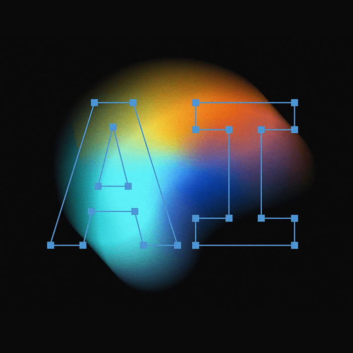
Design Process
The Design Workflow
I was involved quite early in defining our AI assistant. We considered quite different approaches, from a humanoid assistant up to a more abstract look & feel. I came up with different designs under the umbrella of the ImmoScout24 brand look & feel.
Brand Essentials
Logo & Naming
We decided to take the route of creating a sub-brand for the AI assistant. The name itself, HeyImmo, evokes an energetic appeal and invites users to start exploring.
Core Elements
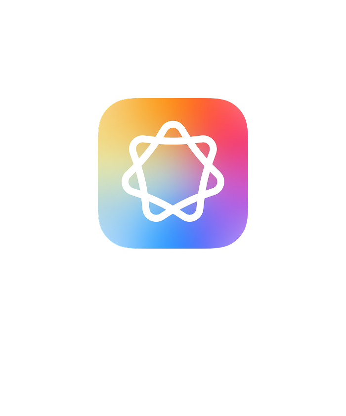
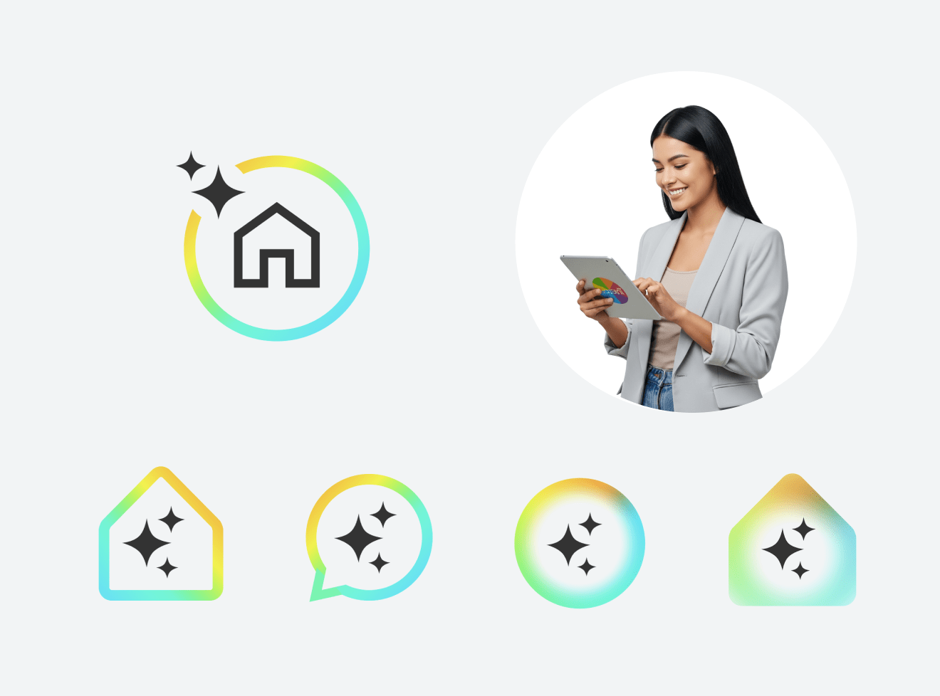
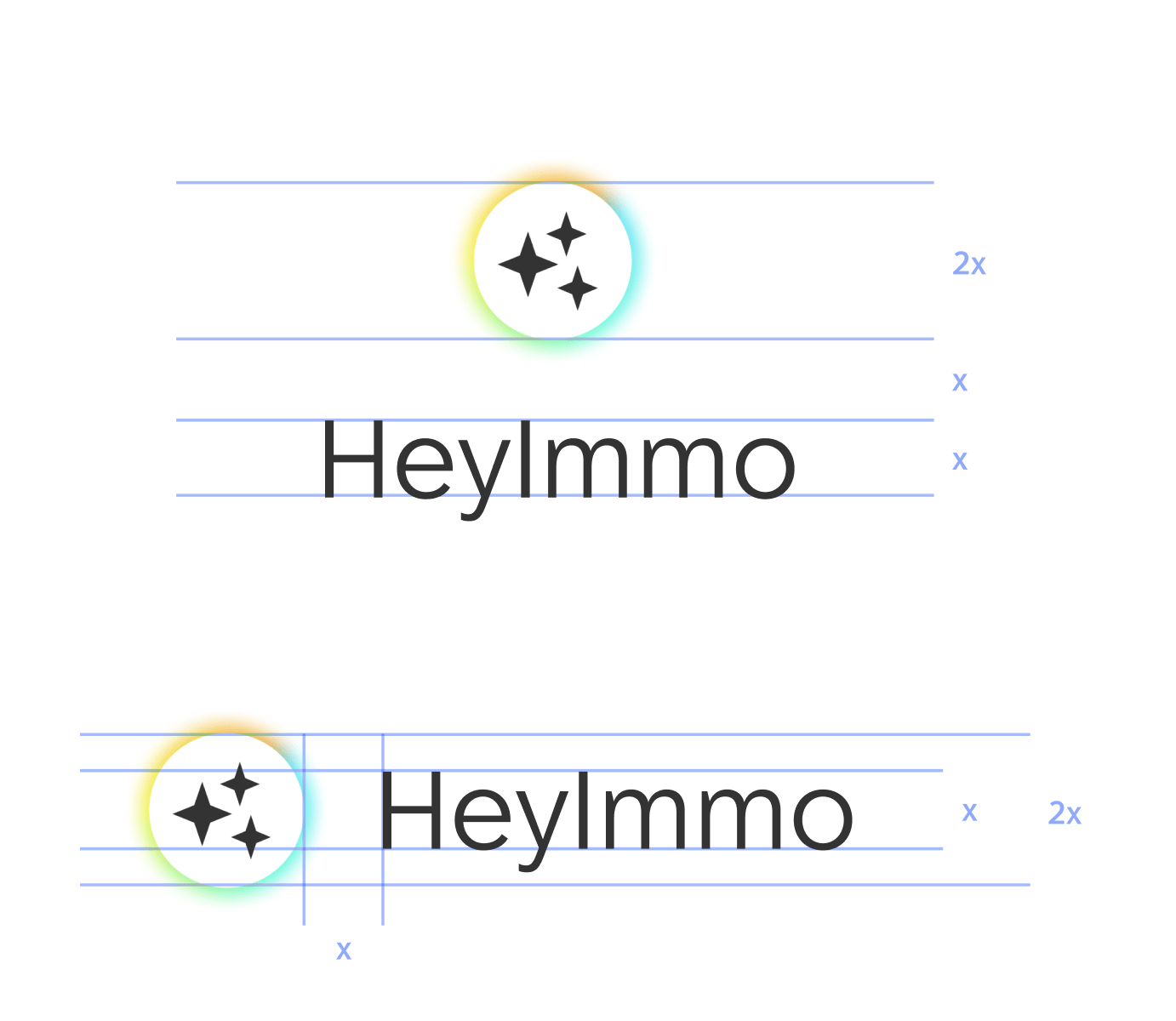
There are three main elements that consisting HeyImmo brand personality: gradient glow (aura), circle and stars. Each one has a different function and brings a different meaning to the HeyImmo personality.
Gradient Glow ‘Aura’
I use clouds made of our brand colors to create an ‘Aura’ glow. It illustrates an universe of market data that behaves like a living thing — unpredictable and chaotic.

Circle
The circle frames a safe space where the thinking process can happen.

Stars
The stars represent the core elements of HeyImmo, evoking extraordinary abilities. This is a common feature that defines the properties of AI.
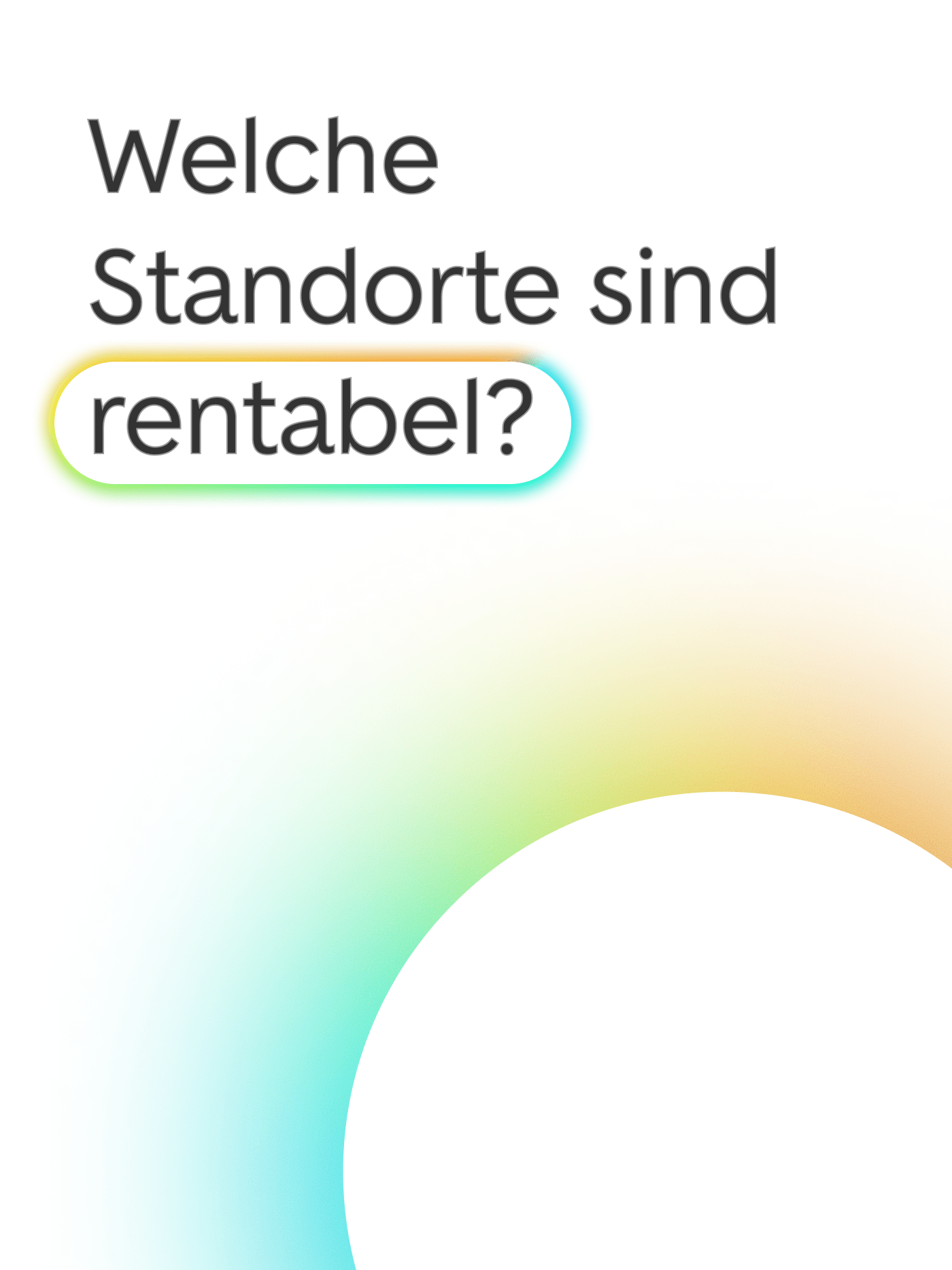
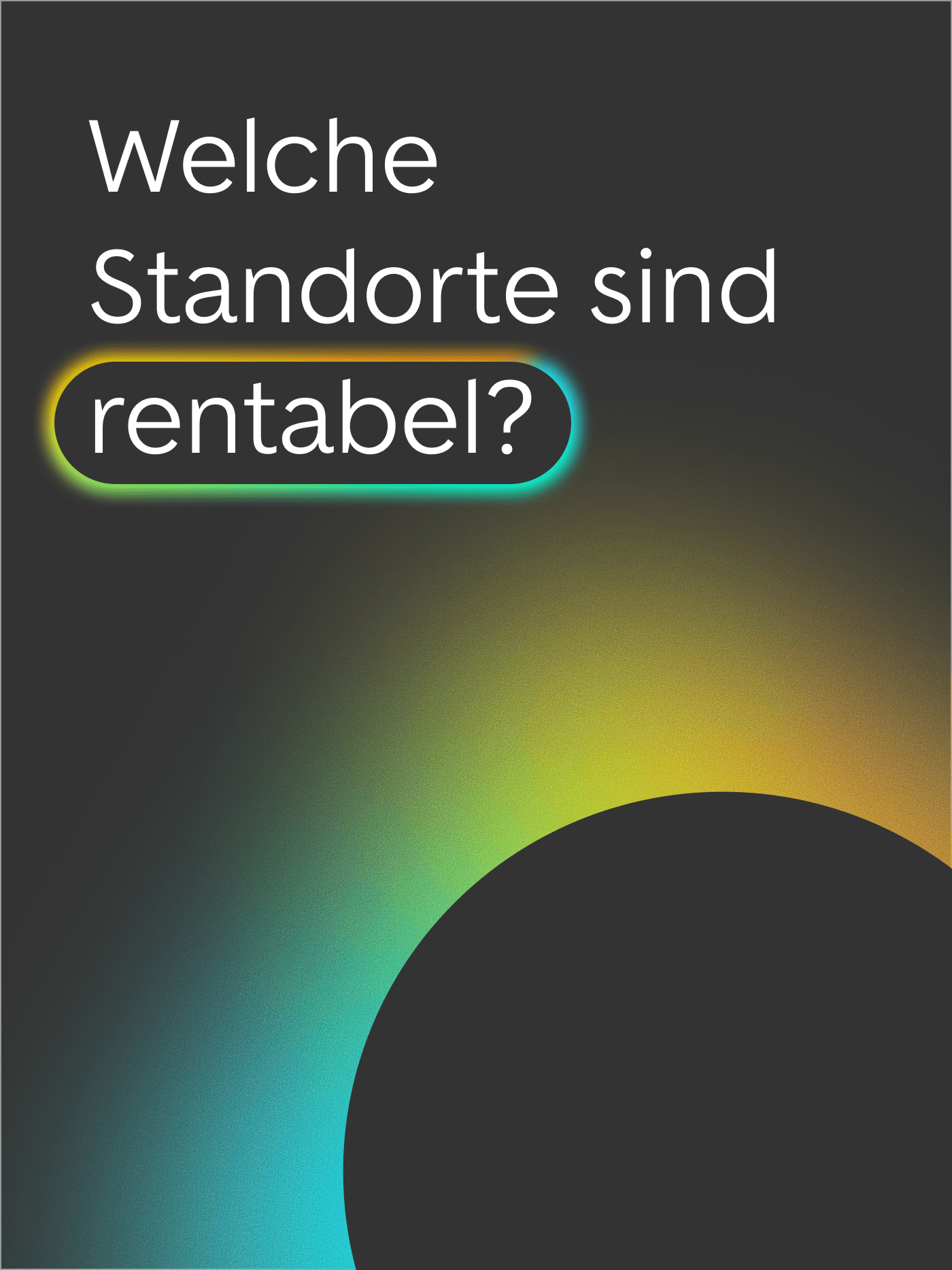
Applications
While providing clear initial rules, HeyImmo look and feel is purely flexible, allowing broad extension in its application. The aura with the glowing color can be used as a “highlighter” or as an element of the brand identity.
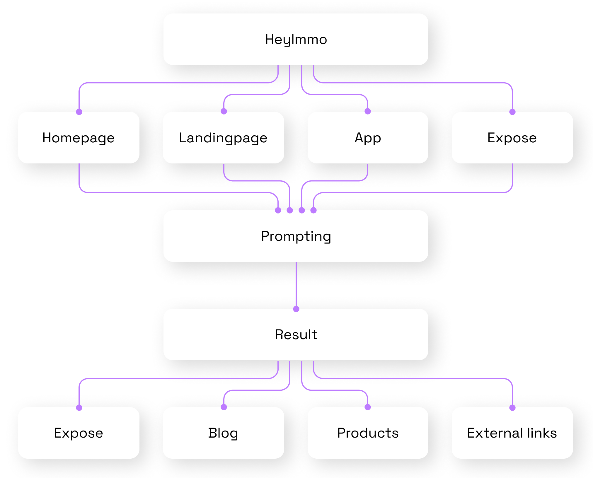
Flow Diagram
Well-Integrated Assistant
HeyImmo is a standalone feature designed to be well spread into the ImmoScout24 ecosystem across various pages, the app and its touchpoints. It was essential to define the assistant’s look and feel to ensure a coherent and consistent user experience.
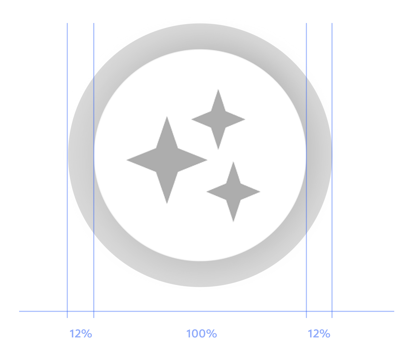
Specifications
Logo dimensions
UI Design
Landing Page
I took part to the concept, design and development of the launch landing page. It serves as the main entry point where users can start prompting with the HeyImmo, learn about its capabilities and clear its doubts through the FAQ section.
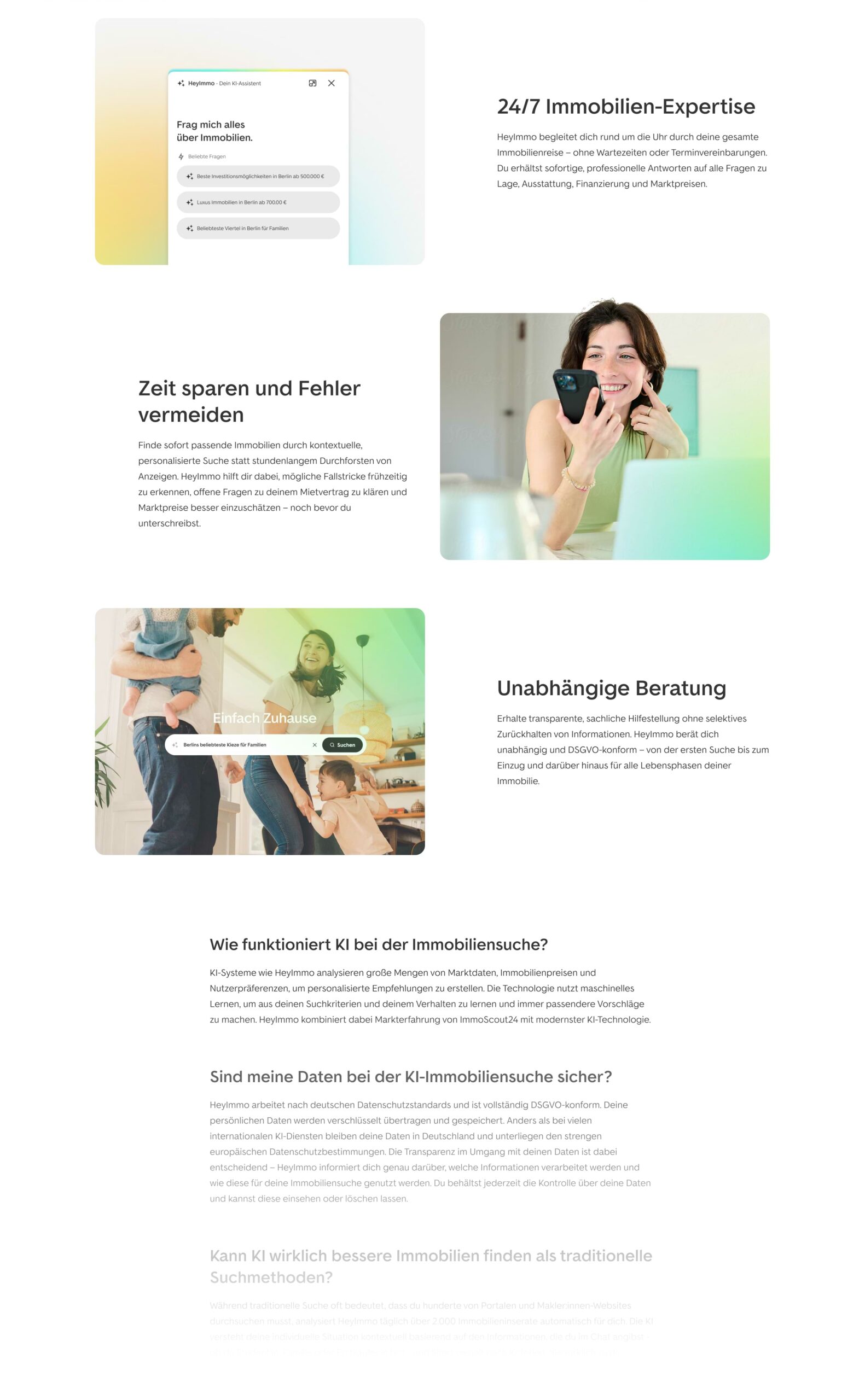
Micro-interactions
To enhance usability and user delight, I helped define micro-interactions for the assistant. The animated aura highlights its unique capabilities and ensures it stands out within the ImmoScout24 environment.
Results
First in search.
First in mind.
We’re proud to have secured the top spot. Landing page design, lightweight frontend and relevant content helped search engines recognise us. This proves that smart UX and keyword-focused content go hand in hand.
Thanks to our initiatives we are ranking with the heyimmo LP on position 1! It means users can now find us organically when typing “heyimmo”
SEO Manager
ImmoScout24
Next project